7 Basic Tools of Quality in Hindi
The Seven Basic Tools of Quality गुणवत्ता से संबंधित समस्या निवारण समस्याओं में सबसे उपयोगी होने के रूप में पहचाने गए ग्राफिकल तकनीकों के एक निश्चित सेट को दी गई एक पदनाम है। उन्हें मूल कहा जाता है क्योंकि वे आंकड़ों में कम औपचारिक प्रशिक्षण वाले लोगों के लिए उपयुक्त हैं और क्योंकि इनका उपयोग Quality संबंधित मुद्दे के विशाल बहुमत को हल करने के लिए किया जा सकता है.
The Seven Basic Tools of Quality निम्न प्रकार से हैं-
- Cause-and-effect diagram (also known as the "fishbone" or Ishikawa diagram)
- Check sheet
- Control chart
- Histogram
- Pareto chart
- Scatter diagram
- Stratification (alternately, flow chart or run chart)
बाद में जापान में नामांकन हुआ, जो Benkei के सात प्रसिद्ध हथियारों से प्रेरित था। यह संभवतः कारू इशिकावा द्वारा पेश किया गया था, जो बदले में व्याख्यान की एक श्रृंखला से प्रभावित था डब्ल्यू एडवर्ड्स डेमिंग ने 1 9 50 में जापानी इंजीनियरों और वैज्ञानिकों को दिया था। उस समय, कंपनियां जिन्होंने सांख्यिकीय गुणवत्ता नियंत्रण में अपने कार्यबलों को प्रशिक्षण देने के बारे में निर्धारित किया था, उन्होंने पाया कि इस विषय की जटिलता ने अपने अधिकांश श्रमिकों को डरा दिया और मुख्य रूप से सरल तरीकों पर ध्यान केंद्रित करने के लिए प्रशिक्षण वापस बढ़ाया जो कि अधिकतर गुणवत्ता-संबंधी मुद्दों के लिए पर्याप्त है।
सात मूलभूत उपकरण सर्वेक्षण नमूनाकरण, स्वीकृति नमूनाकरण, सांख्यिकीय परिकल्पना परीक्षण, प्रयोगों का डिजाइन, बहुविकल्पीय विश्लेषण और संचालन अनुसंधान के क्षेत्र में विकसित विभिन्न विधियों जैसे अधिक उन्नत सांख्यिकीय तरीकों के विपरीत खड़े हैं।
परियोजना प्रबंधन संस्थान परियोजना प्रबंधन की योजना बनाने या नियंत्रित करने के लिए उपयोगी सामान्य औजारों के एक सेट के उदाहरण के रूप में ज्ञान प्रबंधन परियोजना निकाय को एक गाइड में सात मूलभूत उपकरण का संदर्भ देता है
Read these also-
य
प
हम Seven Basic Tools of Quality को Details में जानेंगे
1 . Cause-and-effect diagram (also known as the "fishbone" or Ishikawa diagram
Cause-and-effect diagram (जिसे "fishbone" अथवा Ishikawa diagram के नाम से भी जाना जाता है ) Kaoru Ishikawa द्वारा बनाई गई कारक आरेख हैं जो एक विशिष्ट घटना के कारण दिखाते हैं।

Ishikawa diagram के सामान्य उपयोग उत्पाद डिज़ाइन और गुणवत्ता दोष दोष रोकथाम हैं जो संभावित कारकों को समग्र प्रभाव के कारण पहचानते हैं। अपूर्णता के लिए प्रत्येक कारण या कारण विविधता का स्रोत है। कारणों को आम तौर पर भिन्नता के इन स्रोतों को पहचानने और वर्गीकृत करने के लिए प्रमुख श्रेणियों में समूहित किया जाता है।
2 . Check sheet
Check Sheet एक फॉर्म (दस्तावेज़) है जो डेटा को वास्तविक समय में डेटा एकत्र करने के लिए उपयोग किया जाता है जहां डेटा उत्पन्न होता है। यह डेटा कैप्चर करता है मात्रात्मक या गुणात्मक हो सकता है। जब सूचना मात्रात्मक होती है, तो चेक शीट को कभी-कभी टैली शीट(Tally Sheet) कहा जाता है।

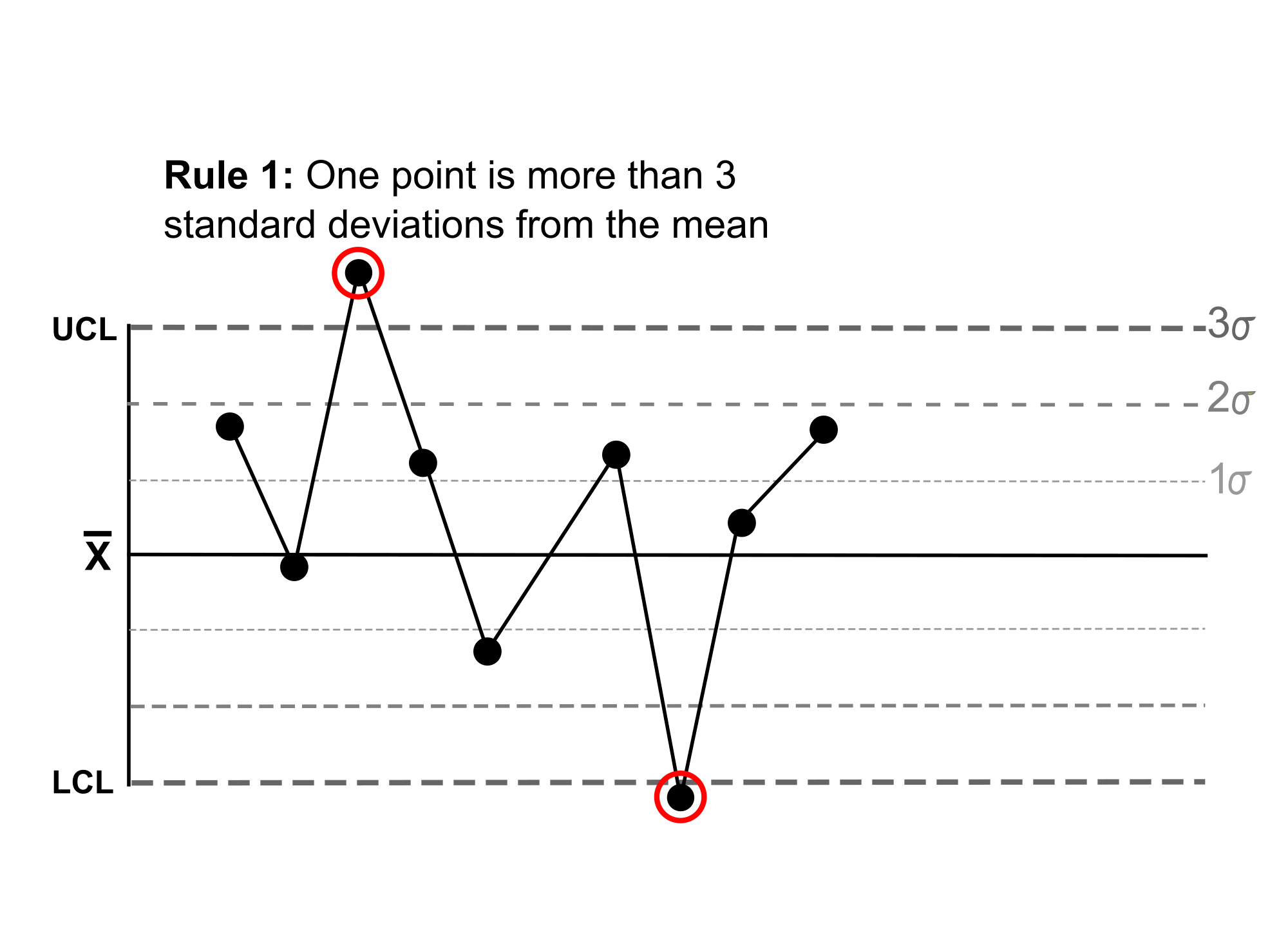
3. Control chart
Control Chart जिसे Shewart Chart (Walter A Shewart के बाद) या प्रक्रिया-व्यवहार चार्ट के रूप में भी जाना जाता है, एक सांख्यिकीय प्रक्रिया नियंत्रण उपकरण है जो यह निर्धारित करने के लिए उपयोग किया जाता है कि कोई विनिर्माण या व्यावसायिक प्रक्रिया नियंत्रण की स्थिति में है या नहीं।

Purpose of Control Chart- यह निर्धारित करने के लिए कि क्या प्रक्रिया को गुणवत्ता से संबंधित समस्याओं के लिए औपचारिक परीक्षा लेनी चाहिए या नहीं.
4. Histogram
Histogram संख्यात्मक डेटा के वितरण का एक सटीक प्रतिनिधित्व है। यह निरंतर परिवर्तनीय (मात्रात्मक चर) की संभाव्यता वितरण का अनुमान है और इसे पहली बार कार्ल पियरसन द्वारा पेश किया गया था। यह एक बार ग्राफ से अलग है, इस अर्थ में कि एक बार ग्राफ दो चर से संबंधित है, लेकिन एक हिस्टोग्राम केवल एक से संबंधित है। हिस्टोग्राम बनाने के लिए, पहला कदम "बिन" (या "बाल्टी") मानों की सीमा है- यानी, मानों की पूरी श्रृंखला को अंतराल की श्रृंखला में विभाजित करें- और उसके बाद प्रत्येक अंतराल में कितने मान गिरते हैं, इसकी गणना करें। डिब्बे आमतौर पर चर के निरंतर, गैर-ओवरलैपिंग अंतराल के रूप में निर्दिष्ट होते हैं। डिब्बे (अंतराल) निकट होना चाहिए, और अक्सर बराबर आकार के होते हैं (लेकिन होने की आवश्यकता नहीं होती है)

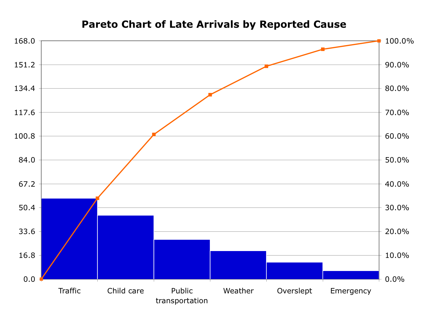
5. ParetoChart
Wilfredo Pareto के नाम पर स्थित Pareto Chart , चार्ट का एक प्रकार है जिसमें बार और रेखा रेखा दोनों शामिल हैं, जहां अलग-अलग मानों को बार-बार अवरोही क्रम में दर्शाया जाता है, और संचयी कुल रेखा द्वारा दर्शाया जाता है

6. Scatter diagram
Scatter Diagrama (also called a scatterplot, scatter graph, scatter chart, scattergram, or scatter diagram) डेटा के एक सेट के लिए आम तौर पर दो चर के लिए मान प्रदर्शित करने के लिए कार्टेशियन निर्देशांक का उपयोग करके साजिश या गणितीय आरेख का एक प्रकार है। यदि अंक रंग-कोडित हैं, तो एक अतिरिक्त चर प्रदर्शित किया जा सकता है। डेटा को अंक के संग्रह के रूप में प्रदर्शित किया जाता है, प्रत्येक में क्षैतिज अक्ष पर स्थिति निर्धारित करने वाले एक चर के मान और लंबवत अक्ष पर स्थिति निर्धारित करने वाले अन्य चर के मान होते हैं

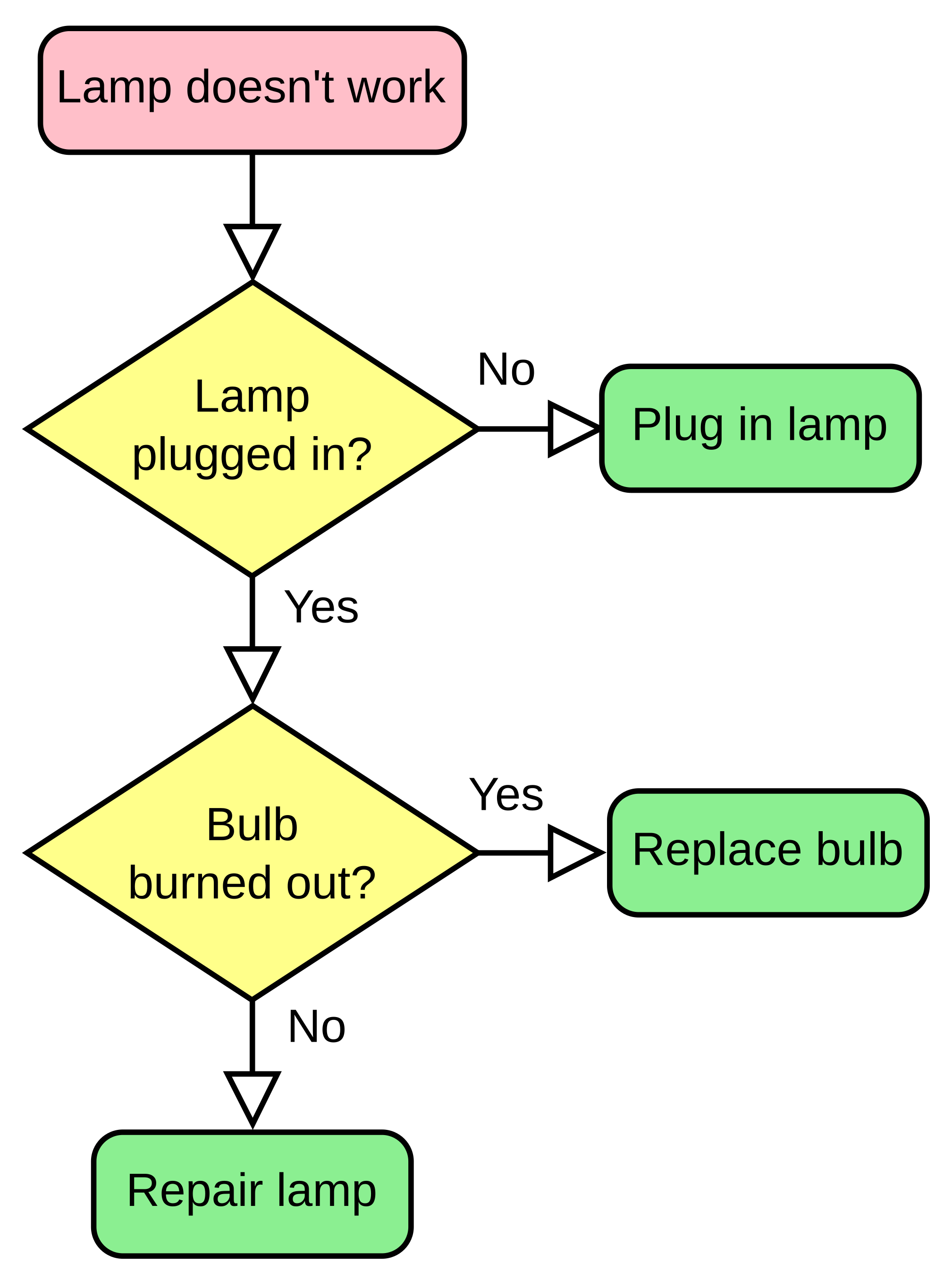
7.Stratification (alternately, flow chart or run chart)
Flow Chart एक प्रकार का आरेख है जो एल्गोरिदम, वर्कफ़्लो या प्रक्रिया का प्रतिनिधित्व करता है। फ्लोचार्ट तीरों के साथ बक्से को जोड़कर विभिन्न प्रकार के बक्से के रूप में कदम और उनके आदेश को दिखाता है। यह आरेखण प्रस्तुतिकरण किसी दिए गए समस्या के समाधान समाधान को दिखाता है। Flowcharts का उपयोग विभिन्न क्षेत्रों में एक प्रक्रिया या कार्यक्रम का विश्लेषण, डिजाइन, दस्तावेज़ीकरण या प्रबंधन में किया जाता है